


Our lighting manufacturer recently discontinued the LED bulb we happily sold for 4 years. This gave us the opportunity to reassess the current state of LED technology. During our quest to find a quality replacement, we took another look at the best approach for lighting artwork while displayed on our Pro Panels system.
Here is a quick overview of what we learned during the process:
Sometimes less is more:
There is a point when too strong of a bulb can actually work against you. Our first instinct was to look at a few higher lumen options (1200 or so). After a close evaluation, we found that the brighter bulbs washed out some of the finer details in a sample photograph and painting. We decided to step the lumens down to around 1000 and found an improvement in overall appearance. The new bulb we selected does have a higher lumen rating than our previous bulb. However we now offer a plug in dimmer that allows you to dial in just the right amount of light to fit the surrounding conditions. To achieve a brighter overall appearance, consider adding an additional bulb or two vs. switching to a bulb with higher lumens.
Take time to assess the color of light you want your work under:
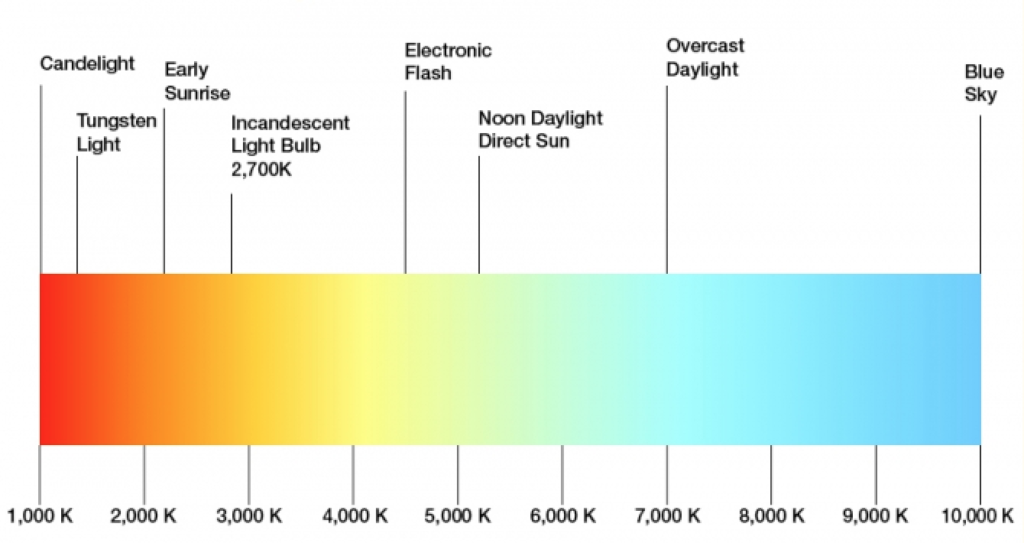
The color of light that the bulb gives off was another area that we looked into. Over the past few years, we’ve received quite a bit of feedback from our customers with their thoughts on our lighting system. Previously, the bulb we offered was an LED available in 3500k and 5000k. On the Kelvin scale, the lower the number, the warmer the light.
Many of our customers had previously used and were happy with the color temperature of halogen lights, which are around 2700K (fairly warm). But they were unhappy with the heat they gave off and the amount of electricity they required. We now offer an energy efficient LED in 3000K along with the 3500K and 5000K. We looked at a 2700K in the LED and in our opinion it did not represent the same color as the halogen, which is why we chose the 3000K.
While the color temperature of the light is a personal preference, we recommend 3000k or 3500k for most types of artwork (photographs, drawings, paintings and mixed media). For jewelry, glass, bright metal or anything that needs a little sparkle, we recommend the 5000k.
Keep in mind that ambient light around you will influence your display space. Outdoors, the natural sunlight filtering through your canopy will alter your booths appearance. It is also likely to change throughout the day. Indoors, high bay lights in a convention center, fluorescent bulbs in an office or a mix of sunlight and artificial light in hotel lobby can all influence your artwork. It may seem counter-intuitive, but we actually found that more light was necessary when setting up at conventions and indoor evens to overcome the ambient light that is already present.
Choosing a Flood vs. a Spot
Our initial thought of using a wider beam spread bulb was reconfirmed. The hot spots on the panel created from spotlights detracted from the artwork, while lighting pieces with a wide flood (60 degree) illuminated the artwork without any noticeable hot spots. Since the light source is fairly close to the artwork, it’s important that the light spreads quickly to ensure the light is even.
To see more information including photos and pricing of the lighting options we offer, please refer to the Lighting Page of our website. And of course if you have any questions feel free to email us or call us at 800.525.4159.
If you found this information helpful, please make sure to share:
 May 25, 2017